Art Style Collection
Original Abstract
Paintings
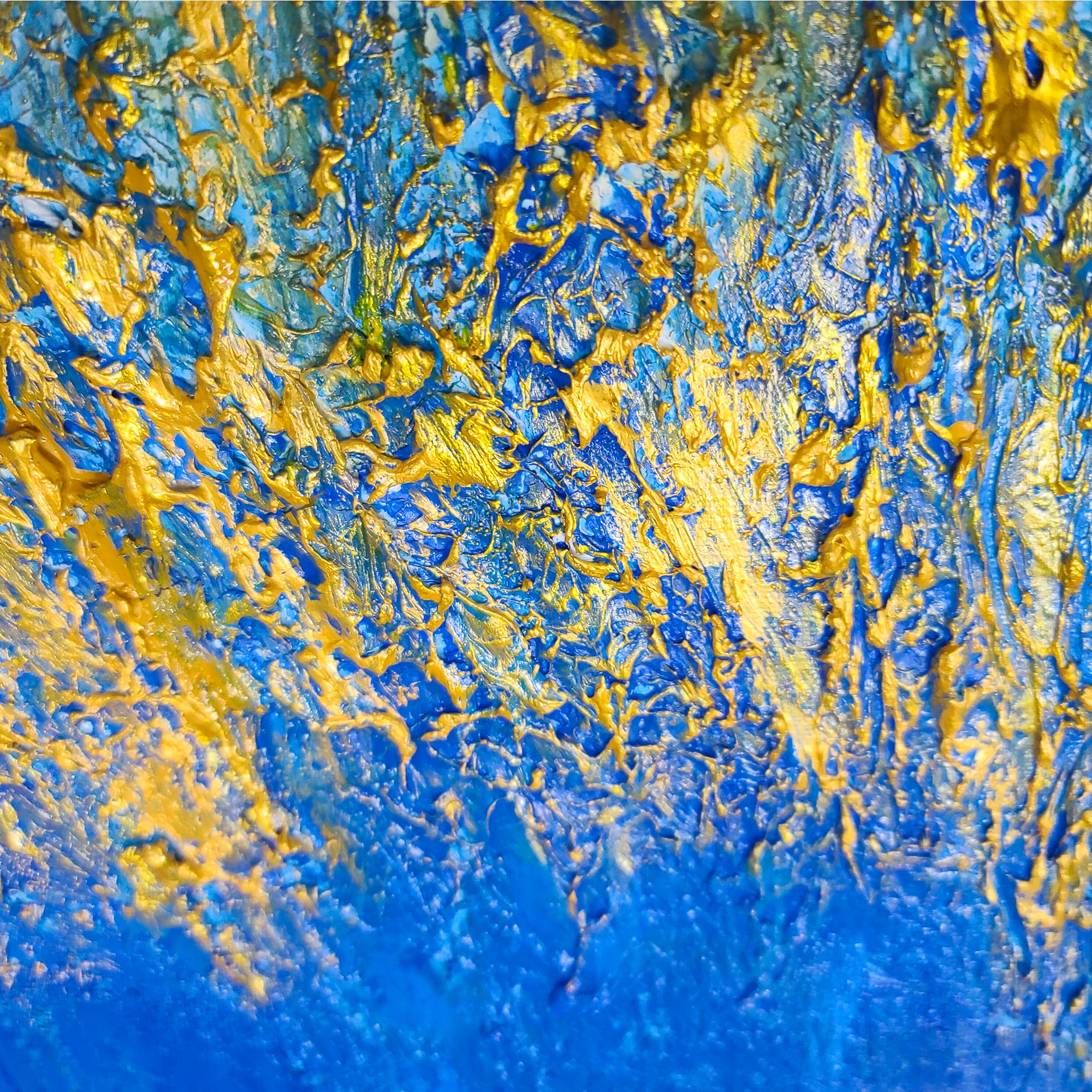
Every abstract painting in the Lei-Kol catalog is a true original — built by hand over weeks in dimensional acrylic layers. No prints, no editions, no AI generations. Heavy impasto texture gives each piece a physical presence that shifts with the light and rewards a lifetime of looking.
The Collection
Abstract Originals
A Brief History of Abstract Art
Abstract art did not emerge from nowhere. It was the product of a specific historical moment — roughly 1910–1920 — when artists across Europe began systematically removing recognizable subject matter from their work. Wassily Kandinsky is widely credited with painting the first purely abstract watercolor in 1910, though Hilma af Klint was creating geometric abstractions as early as 1906. The movement exploded after World War I: Kazimir Malevich reduced painting to a black square on a white ground (1915); Piet Mondrian built compositions from nothing but horizontal and vertical lines and primary colors; and the Abstract Expressionists of 1940s–50s New York — Jackson Pollock, Mark Rothko, Willem de Kooning — made abstraction the dominant language of modern art.
What united these artists was a shared conviction that art did not need to represent anything. Color, form, line, and texture could carry meaning directly — faster and deeper than any recognizable image. A Rothko color field hits the viewer before they have time to think about it. A Pollock drip painting communicates energy and motion without depicting a single object. Abstract art speaks to the part of the brain that responds to rhythm, balance, and contrast — not the part that names things.
Types of Abstract Art
Geometric Abstraction
Built from shapes — circles, squares, lines, grids. Pioneered by Malevich, Mondrian, and the Bauhaus. Clean, architectural, often minimal. Works well in modern, minimalist, or industrial interiors.
Lyrical Abstraction
Softer, more organic. Fluid forms that suggest nature without depicting it — like clouds, water, or wind rendered in paint. Often uses washes, drips, and blurred edges. Creates a calm, meditative presence in a room.
Color Field
Large expanses of a single or limited color palette. Rothko is the master — his paintings are less about what you see and more about what you feel standing in front of them. Deeply immersive. Best in rooms where you can sit and look for a while.
Gestural / Action Painting
The most physically expressive style. Paint is thrown, dripped, scraped, and swept across the canvas. Pollock, de Kooning, and Franz Kline defined it. The energy is visible in every mark. Powerful in living rooms, entryways, and anywhere you want energy.
Textural / Impasto Abstraction
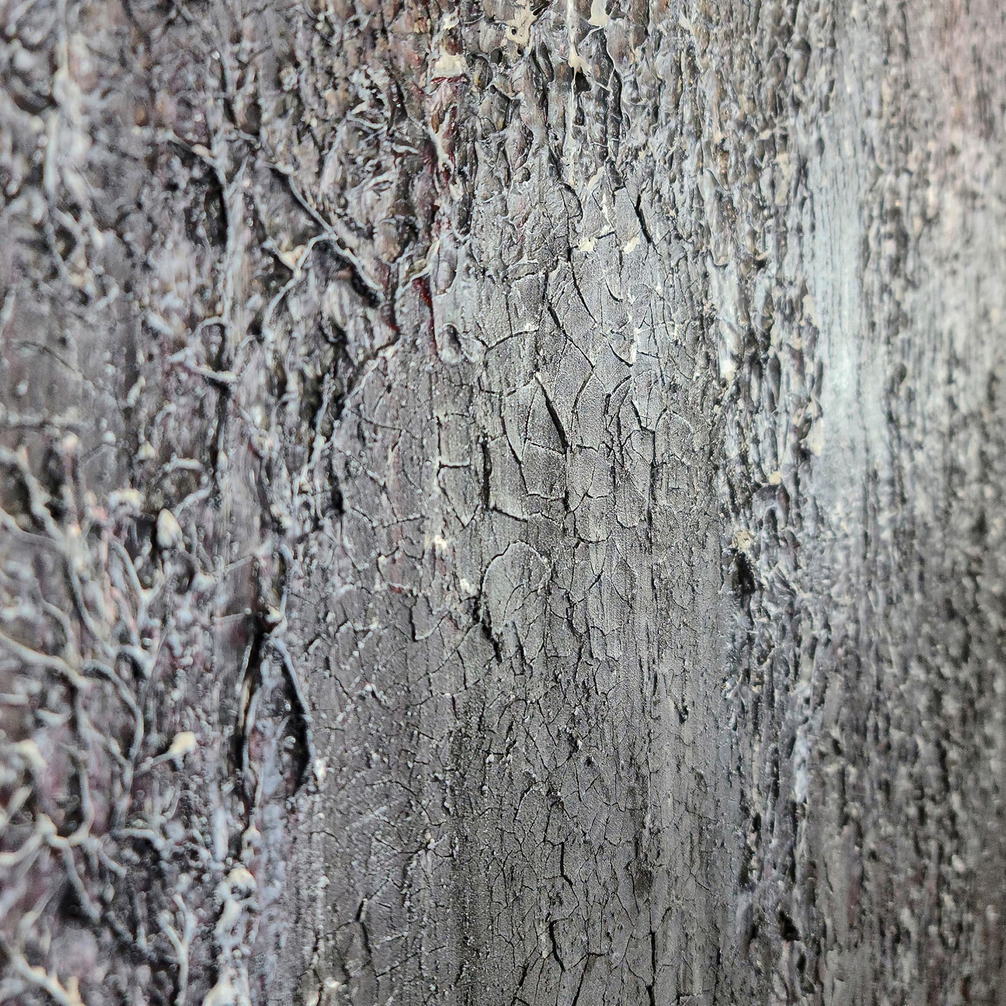
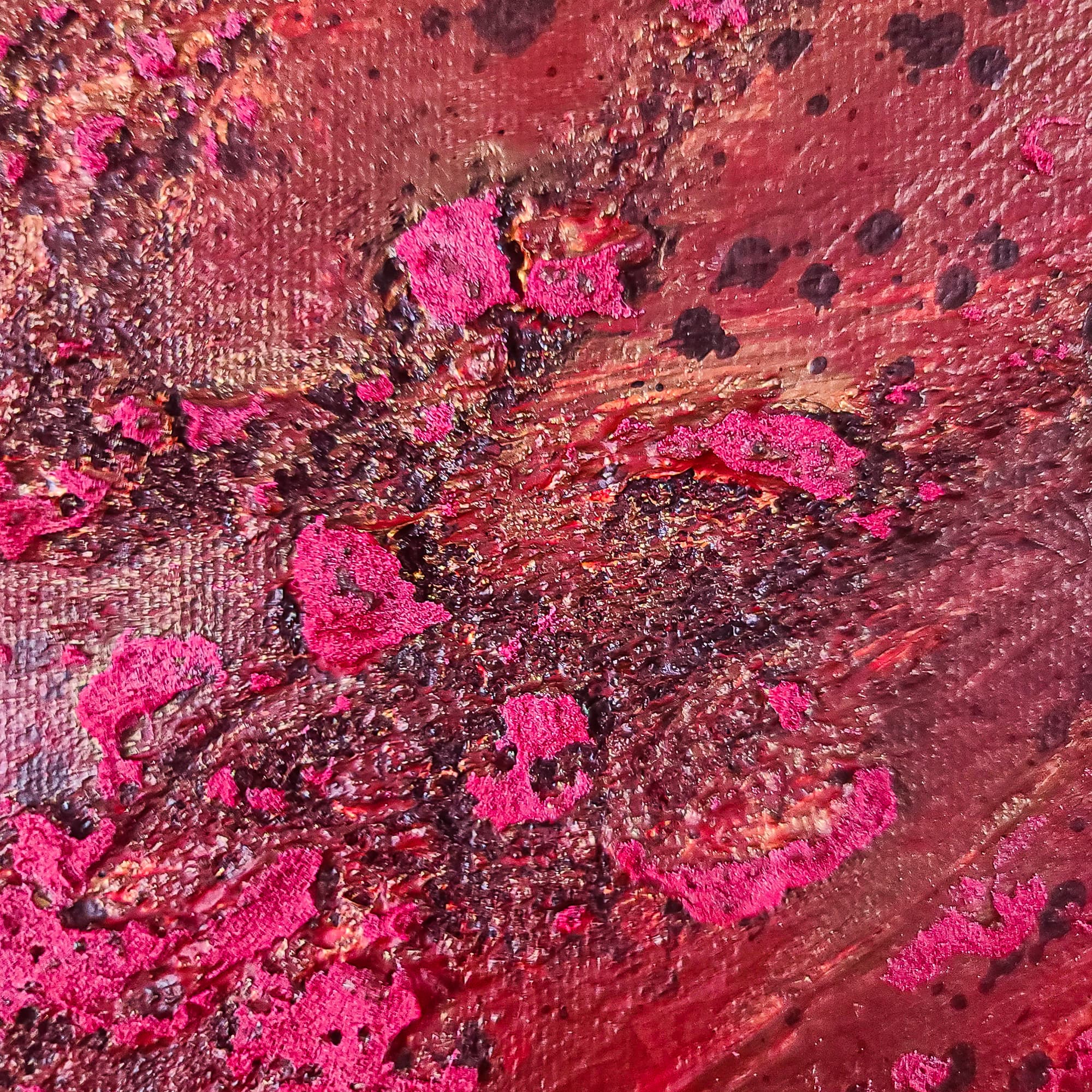
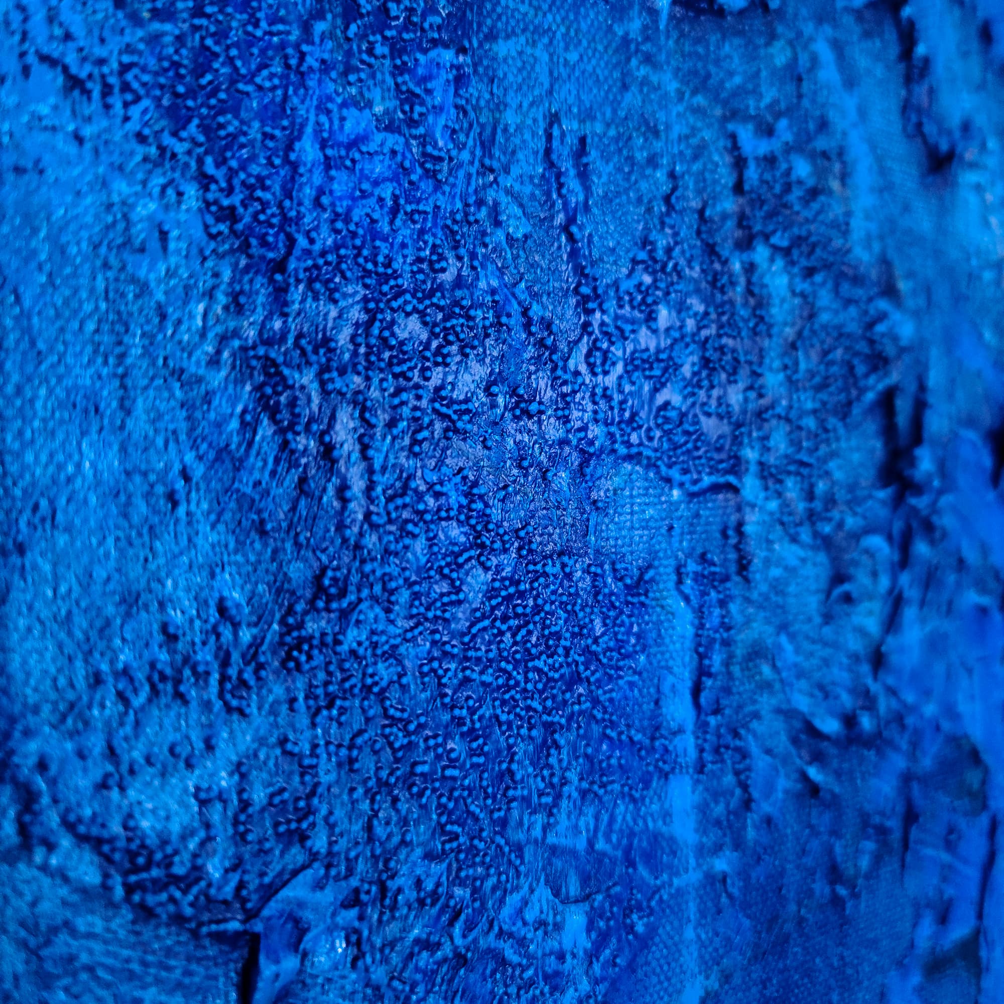
Lei-Kol's primary mode. Paint is built up in thick layers until the surface becomes sculptural. Less about recognizable gestures and more about the physical presence of the material itself. The texture IS the composition. Works in any room with natural light.
Minimalist Abstraction
Stripped to essentials. A single line. Two colors. Empty space treated as content. Agnes Martin, Robert Ryman, and Ellsworth Kelly. Quiet, demanding, and surprisingly powerful at scale. Ideal for spaces that need calm.
Color Psychology in Abstract Art
Abstract art works on the viewer before the conscious brain gets involved. Color is the primary driver of that response. While individual reactions to color are personal, decades of research suggest consistent patterns that abstract artists — including Lei-Kol — actively use:
| Color | Psychological Effect | Best Room |
|---|---|---|
| Deep Blue | Calm, depth, introspection. Lowers heart rate. | Bedroom, study, meditation space |
| Warm Gold / Ochre | Warmth, optimism, grounded energy. | Living room, dining room, entryway |
| Bold Red | Energy, passion, appetite stimulation. | Dining room, creative workspace |
| Forest / Sage Green | Balance, restoration, connection to nature. | Any room — green is the most versatile color in abstract art |
| Cool Gray / Silver | Sophistication, neutrality, calm backdrop. | Office, hallway, minimalist interiors |
| Black + White | Drama, contrast, timelessness. | Gallery wall, statement piece above a mantel |
| Coral / Terracotta | Warmth without aggression. Earthy, welcoming. | Living room, sunroom, Southwest-style interiors |
| Deep Purple | Luxury, creativity, mystery. | Master bedroom, library, mood-lit spaces |
How Abstract Art Works in Different Rooms
Living Room
Go large. An abstract painting above the sofa should be 60-75% of the sofa's width. Gestural or textural abstracts work best here — they reward the hours you spend in this room.
Bedroom
Choose calmer palettes — blue, sage, lavender, warm gray. A single large piece above the bed or two smaller abstracts on opposite walls. Avoid high-energy reds and oranges.
Dining Room
Warm tones work beautifully — gold, terracotta, deep red. A well-lit abstract becomes a dinner party conversation piece. Position a picture light above it at a 30-degree angle.
Home Office
Geometric or minimalist abstracts support focus. Avoid overly busy compositions directly behind your monitor — they can be distracting on video calls. Place the painting on a wall you face when thinking, not the wall behind your screen.
Entryway
First impression real estate. A vertical abstract makes a tall statement. Bold colors welcome guests. This is the place for a piece that announces 'someone interesting lives here.'
Hallway
Often overlooked — but hallways are galleries. A series of smaller abstracts in a line creates a museum-like progression. Consistent framing ties them together.
How to "Read" an Abstract Painting
One of the most common things people say in front of abstract art is "I don't get it." This is the wrong question. Abstract art is not a puzzle to be solved or a message to be decoded. It is an experience to be had. The right question is not "what does it mean?" but "what does it do to me?"
Here is a simple approach: stand in front of the painting for at least 60 seconds — a full minute, which is longer than it sounds. Do not name anything. Do not try to find shapes. Just let the colors and forms affect you. Notice where your eye goes first. Notice where it lingers. Ask yourself: does this painting make me feel calm or energized? Does it pull me in or push me away? Is it warm or cool? Heavy or light? These are the real responses that abstract art is designed to produce — and they are more honest than any intellectual analysis.
With textured abstracts like Lei-Kol's, there is an additional dimension: light. Walk past the painting. Watch how the impasto ridges catch light from different angles. See how the painting changes at morning, noon, and evening. A textured abstract is not a static image — it is a living surface that interacts with the light in your room all day, every day. That relationship is the heart of what makes a textured original worth owning.
Why Textured Abstracts Are Special
Abstract art speaks directly to emotion without routing through recognition. It is not about something — it IS something. Color, texture, and composition work on the viewer before the brain has time to name what it is seeing. When that abstract work is a true original — hand-painted with heavy impasto, not printed — the effect multiplies. Real brushwork casts real shadows. Real pigment has real depth. The painting changes as light shifts from morning to evening. A print cannot do any of this.
Lei-Kol abstract originals are built for this living relationship with a wall. Each piece is worked and reworked over weeks — paint laid down, scraped back, built up again — until the surface has genuine sculptural presence. The results are paintings that anchor a room rather than decorating it. Every abstract piece in the catalog is a true one-of-a-kind: when it sells, that exact painting is gone from the world forever.
For collectors building a serious collection, abstract originals are often the foundation. They do not date the way representational art can. A landscape painted in 1970 looks like 1970. An abstract from 1970 — if it is good — looks timeless. This is why abstract art dominates museum collections and auction records. It is not about a specific time, place, or subject. It is about the fundamental building blocks of visual experience: color, form, texture, and the ineffable thing that happens when a real painting meets real light.
Explore Related
Explore Abstract Art Further
Heavy Texture Acrylic Paintings
How impasto technique creates the dimensional surfaces that make abstract paintings come alive.
One-of-a-Kind Original Art
What it means when an abstract painting exists only once in the world.
Large Textured Wall Art
How scale transforms abstract art — from accent piece to room-defining statement.
Original Art vs Prints
Why a printed abstract can never match the presence of a real impasto original.
How to Choose the Right Painting Size
Size-to-room ratios for abstract works in every space.
Art Gallery
Browse all available abstract originals — each one a true one-of-a-kind.