The Fear of Mixing
Interior design rules are often phrased as absolutes: do not mix metals, do not mix wood tones, do not mix art styles. Like most rigid design rules, these exist to prevent the worst outcomes — chaotic rooms assembled without any governing principle. But the truth is that the most memorable interiors almost always break the "no mixing" rule. They combine a vintage oil portrait with a contemporary abstract, a textured impasto piece with a minimalist line drawing, creating rooms that feel curated rather than catalog-ordered.
The key is not avoiding mixing — it is learning how to mix with purpose.
Find Your Unifying Thread
Every successful eclectic arrangement has at least one unifying element. It does not have to be obvious — it just has to be consistent across the pieces you are combining.
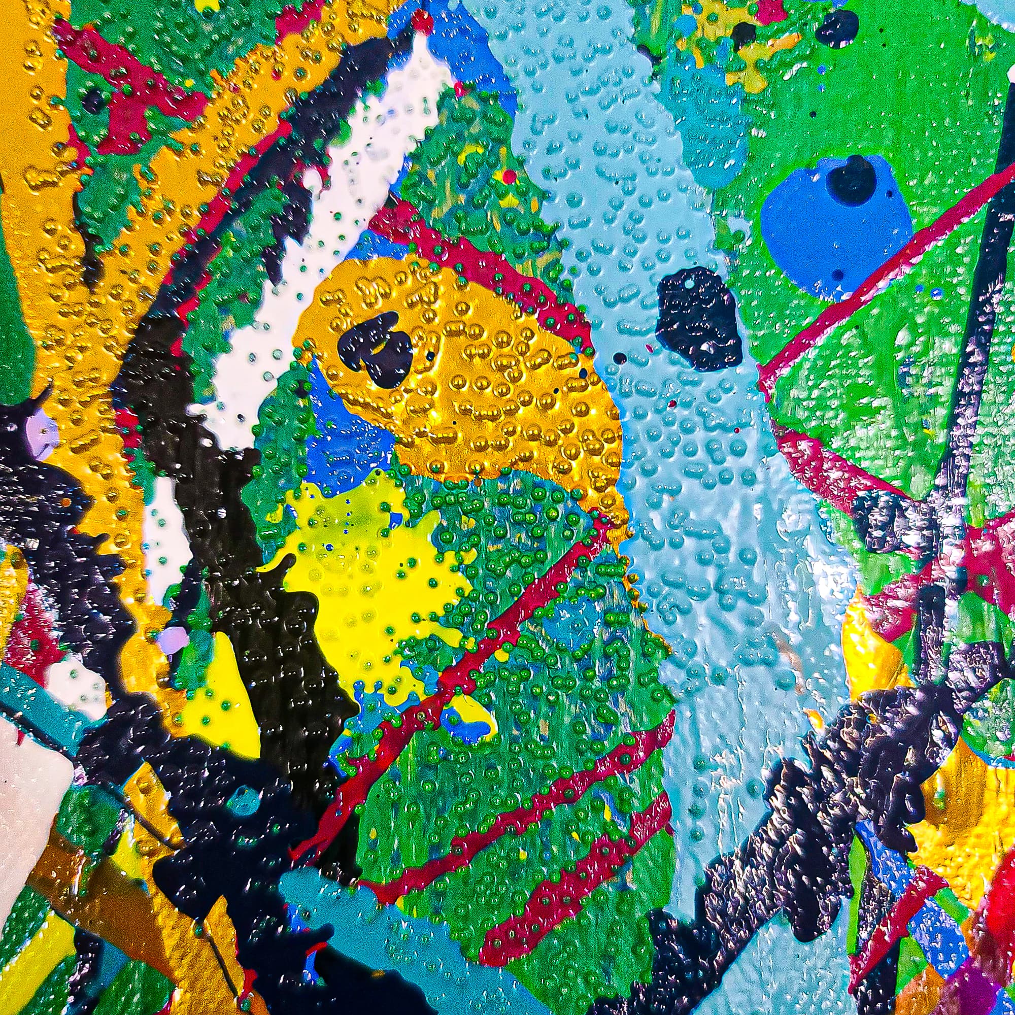
Unify by color: Select art from different styles that share one or two colors. A bold textured painting like Dominion with its vibrant Olympic-inspired palette and a minimalist abstract with a single matching accent tone can coexist because the shared color creates visual conversation between them.
Unify by framing: Disparate art styles look cohesive when presented in matching frames. The uniformity of the frame signals intentionality — the content can be wildly different because the presentation says "these belong together."
Unify by theme: An all-abstract wall, an all-landscape wall, or an all-monochromatic wall. The subject matter or palette unifies even when the individual pieces differ dramatically in style and technique.
Unify by scale: Keeping all pieces within a similar size range creates rhythm across the wall, even if the art styles vary wildly.
Create a Clear Hierarchy
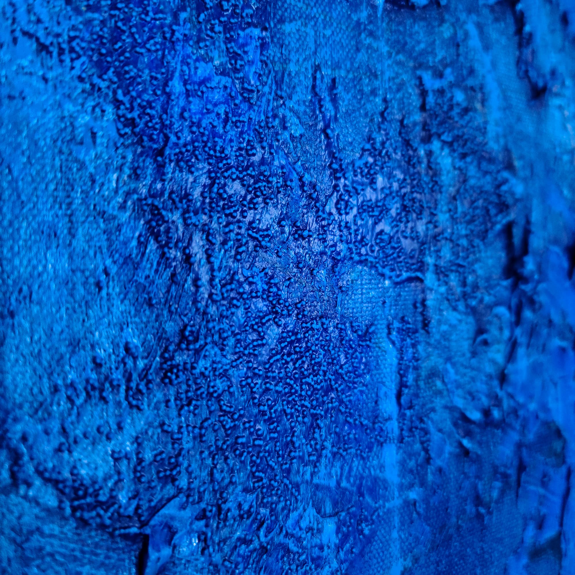
In an eclectic wall, one piece should dominate. This is typically the largest, most textured, or most visually intense piece. It serves as the anchor that the other pieces orient around. In a Lei-Kol living room installation, a large piece like Maui or Bipolar (48 × 60 inches) naturally occupies this role — its physical presence and heavy texture make it the gravitational center of the wall.
The supporting pieces should be smaller, simpler, or both. They provide variety and texture to the arrangement without competing with the anchor piece for primacy.
Spacing: The Hidden Rule
On a gallery wall, spacing between pieces matters as much as the pieces themselves. The most common spacing is 2 to 3 inches between frames. Keeping spacing consistent across an eclectic mix of styles signals order and intentionality — the visual chaos of different art styles is contained within a disciplined grid or arrangement.
For a more dramatic, salon-style wall, use tighter spacing (1 to 2 inches) and fill an entire wall from floor to ceiling or wainscoting. For a cleaner, more modern look, keep spacing generous (3 to 4 inches) and limit the total number of pieces.
The Texture Advantage
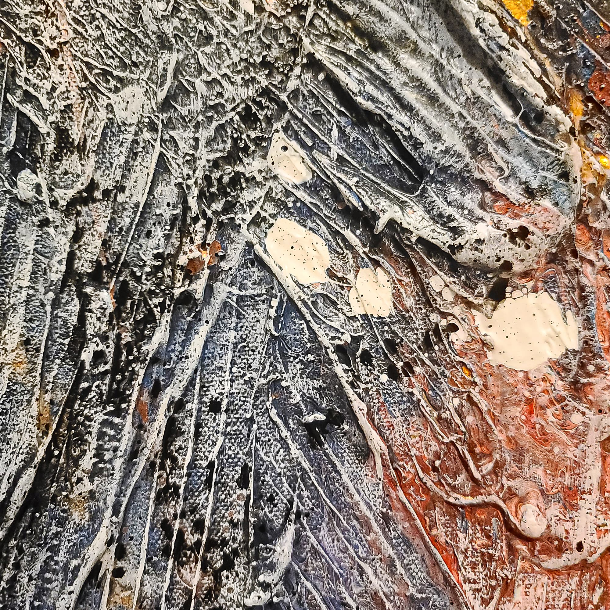
One heavily textured painting can elevate an entire gallery wall because the physical variation adds a dimension that flat prints cannot replicate. A smooth watercolor, a graphic print, and a textured impasto piece like Mushrooms create a sensory range that keeps the eye engaged across the entire arrangement.
Test Before You Commit
Before putting holes in your wall, lay the arrangement on the floor in front of the wall. Live with it for 24 hours. Adjust. The floor test reveals what works and what does not — whether the hierarchy is clear, whether the spacing feels right, whether the pieces truly belong together. Once you are satisfied, transfer the arrangement to the wall piece by piece.
For help selecting pieces that work together across styles, contact Lei-Kol. She personally advises collectors on creating cohesive walls from the pieces in her collection.
Tags