Minimalism Demands More from Art, Not Less
There is a common misconception that minimalist spaces need minimal art — something small, quiet, and unobtrusive. The opposite is true. In a room where every object is carefully chosen and everything extraneous has been removed, the remaining pieces need to be extraordinary. Art in a minimalist space does not get to hide behind competing decor. It stands alone, and it must be powerful enough to hold the room.
Why Texture Thrives in Minimal Rooms
Minimalist interiors tend to be dominated by smooth surfaces: polished concrete, clean drywall, glass, and metal. The visual and tactile vocabulary is flat. Introducing a heavily textured painting into this environment creates a striking contrast — the organic, built-up surface of the painting becomes the most physically interesting object in the room.
A piece like Snow Storm demonstrates this perfectly. Its white-on-white palette fits seamlessly into a minimalist color scheme, but its dramatic texture gives it a physical presence that smooth walls and flat furniture cannot provide. It adds dimension without adding visual clutter.
Color Strategy in Minimalist Spaces
Minimalist rooms typically work within a narrow palette — whites, grays, blacks, and natural tones. Art in these spaces can either complement the existing restraint or provide the room's single bold statement of color.
Tonal Approach
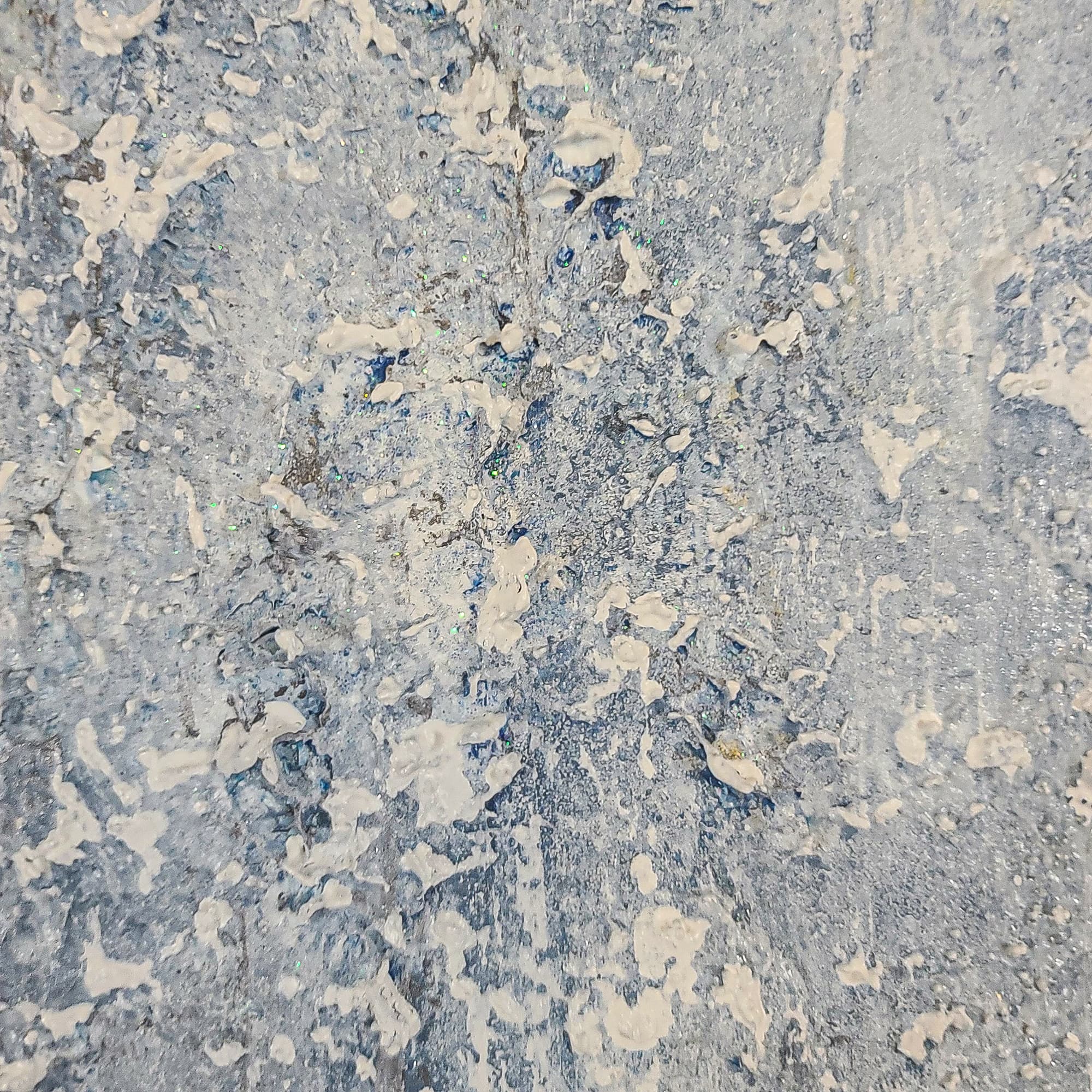
Choose art that works within the room's existing palette but adds depth through texture and value variation. Gray Day, with its layered gray tones inspired by Seattle's gum wall, is an example of tonal art that fits a minimal palette while adding physical richness.
Contrast Approach
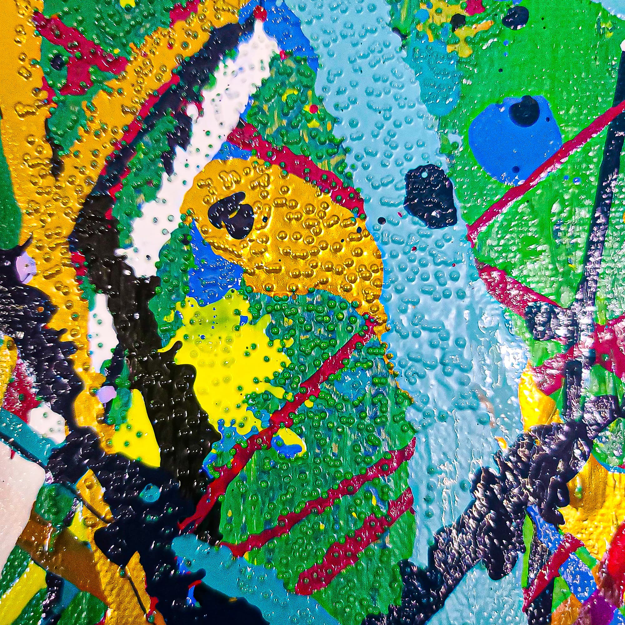
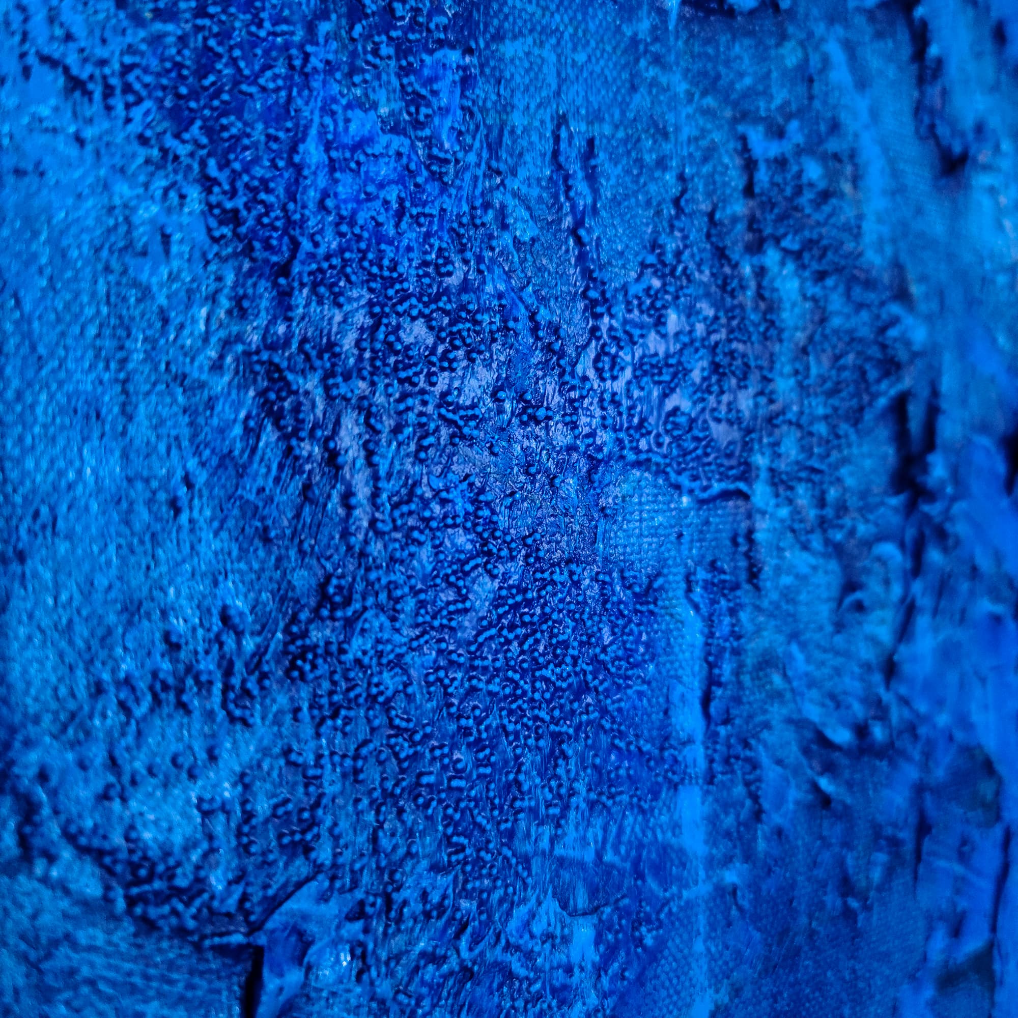
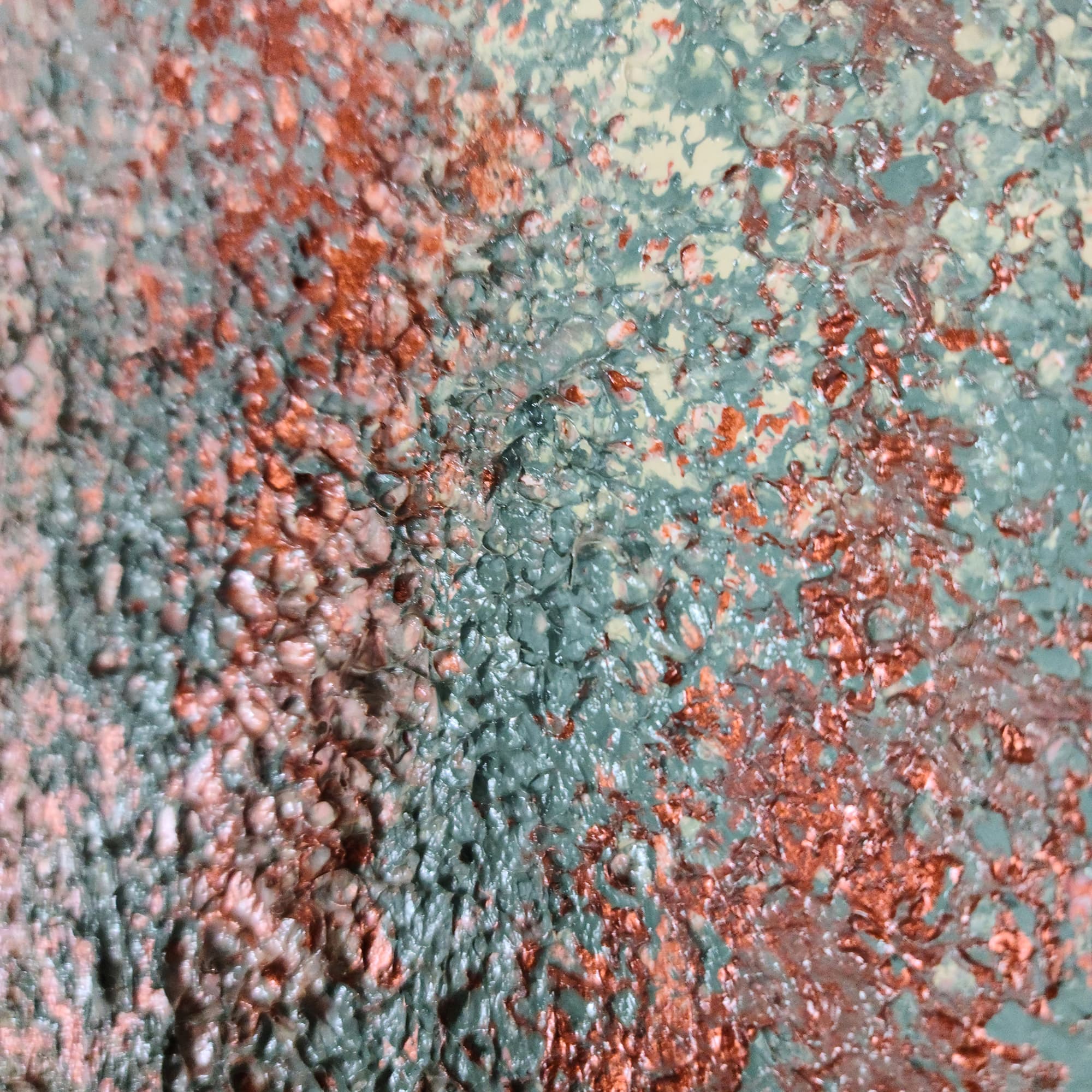
Use art as the room's single point of bold color. In an all-white or all-gray room, a painting with deep blues or warm golds becomes the focal point that gives the entire space its character. Maui, with its molten gold tones, would be a transformative presence in an otherwise neutral minimalist room.
Scale in Minimal Spaces
One large piece is always more effective than multiple small pieces in a minimalist context. A gallery wall of small frames introduces visual complexity that conflicts with the minimalist ethos of reduction and clarity. A single, well-proportioned painting on a clean wall is the minimalist ideal.
The piece should occupy enough wall space to feel intentional — two-thirds of the available wall width is a good starting point. In a minimalist room with generous open walls, do not be afraid to go large. The negative space around the painting is part of the composition.
Hanging and Presentation
In minimalist spaces, how you present the art matters as much as the art itself:
- No ornate frames: Textured paintings on gallery-wrapped canvas (painted on the sides) can be hung without a frame, which is the cleanest, most minimalist presentation.
- Perfect hanging: Use a level. In a spare room, a slightly crooked painting is glaringly obvious.
- Breathing room: Leave generous space between the art and any furniture below or beside it. The empty wall is not wasted space — it is part of the design.
The Right Pieces for Minimal Rooms
From the Lei-Kol collection, these pieces are particularly well-suited to minimalist interiors:
- Snow Storm — White-on-white drama with extreme texture
- Gray Day — Subtle gray tones with a layered, meditative surface
- Bipolar — High-contrast black and white, bold and clean
- Stardust — Dark field with metallic accents, cosmic and restrained
Contact Lei-Kol for a free mock-up showing how any piece would look in your specific space.
Tags