Color Guidance
How to Choose
Art Colors
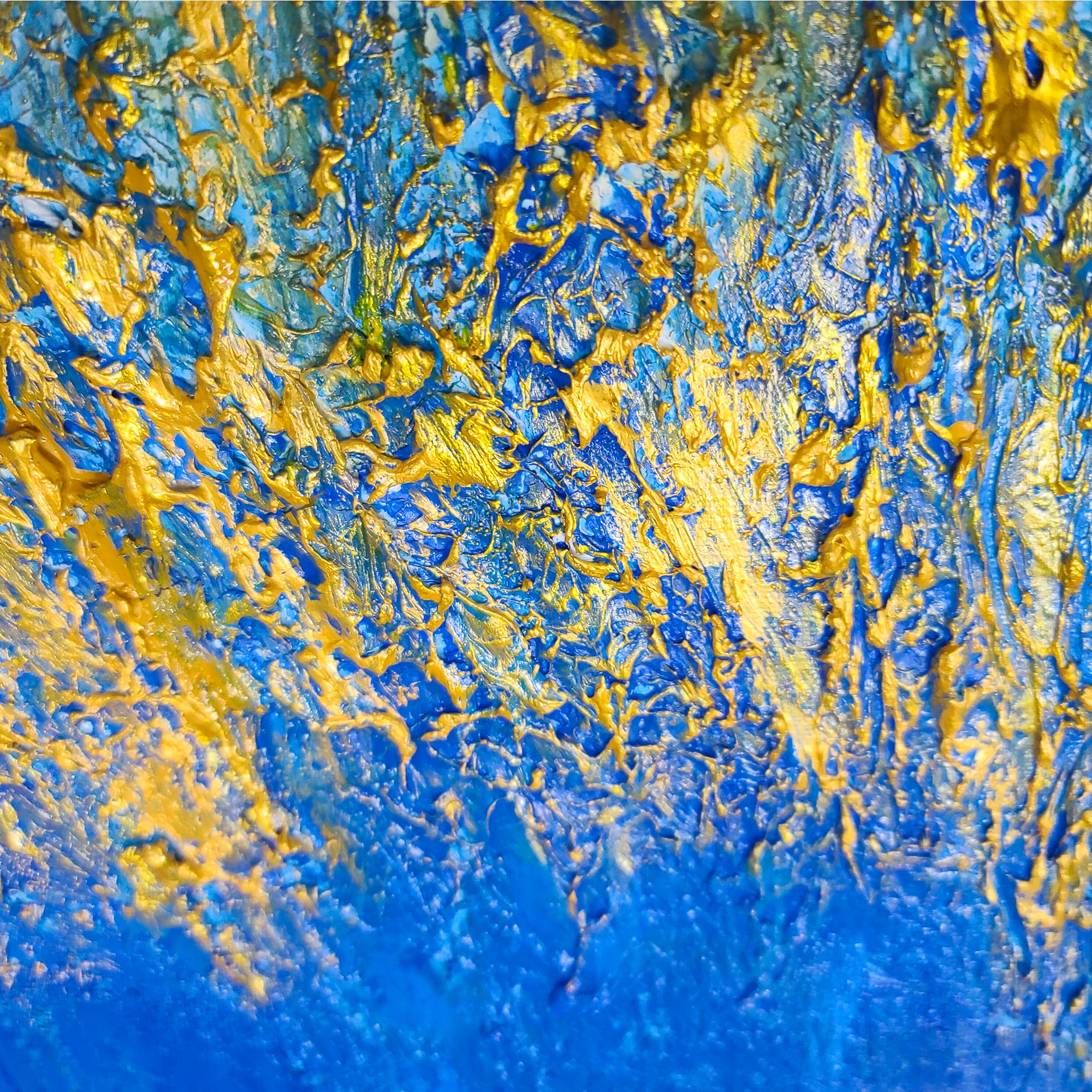
The right painting color against the right wall color creates magic. The wrong combination falls flat. This guide matches common wall colors to the Lei-Kol originals that sing against them.
White / Neutral Walls
You have the most flexibility. Any palette works against white — but bold, colorful paintings pop hardest. Gold and warm pieces (Maui) or dramatic black-and-white (Bipolar) create intentional contrast. Lean into it rather than playing it safe.
Gray Walls
Warm grays pair well with gold, rust, and earthy palettes (Maui, Brick and Mortar). Cool grays love blue and teal pieces (Riptide, Waterfalls). Avoid matching gray with gray-toned art — the room goes flat.
Beige / Cream Walls
These warm neutrals want color. Blue and cool-toned paintings (Blue Denim, Stardust) create crisp contrast. Warm palettes (Cheesecake, Dominion) blend harmoniously for a tonal, layered look.
Dark / Bold Walls
Deep charcoal, navy, or green walls need art that either contrasts dramatically or complements deeply. Gold pieces (Maui) pop against dark walls. Black-and-white (Bipolar) reads as sharp and architectural. Lighter pieces (Gray Day, Waterfalls) create breathing room.
Blue Walls
Blue walls want warmth. Gold, orange, and rust tones (Maui, Blood Moon, Dominion) provide complementary contrast. Avoid layering blue art on blue walls unless you are deliberately going tonal.
The Golden Rule of Color
Choose your art first, then build the room around it — not the other way around. The painting should be the emotional anchor; everything else (cushions, rugs, accessories) plays supporting roles. If you already have a fully furnished room, choose art that either contrasts with the dominant wall color or complements it deliberately. Avoid matching too closely — a painting that blends in is invisible.