Color Speaks Before Words
Before you consciously register what a painting depicts, your nervous system has already responded to its color. Red elevates heart rate and blood pressure. Blue triggers the release of calming hormones. Yellow activates the brain's alertness centers. This is not metaphor — it is measurable physiology. When you choose art for your home, you are choosing the chemical cocktail your brain will produce every time you enter the room.
Warm Colors: Energy, Passion, Warmth
Reds, oranges, and warm golds stimulate the sympathetic nervous system — the body's "go" mode. A painting dominated by warm tones will make a room feel energized, intimate, and alive. These are ideal for social spaces: dining rooms, living rooms, home offices where creative energy matters. Warm-toned textured paintings amplify this effect because the impasto surface catches warm light and radiates it back with added depth.
Cool Colors: Calm, Focus, Spaciousness
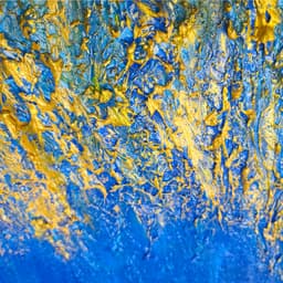
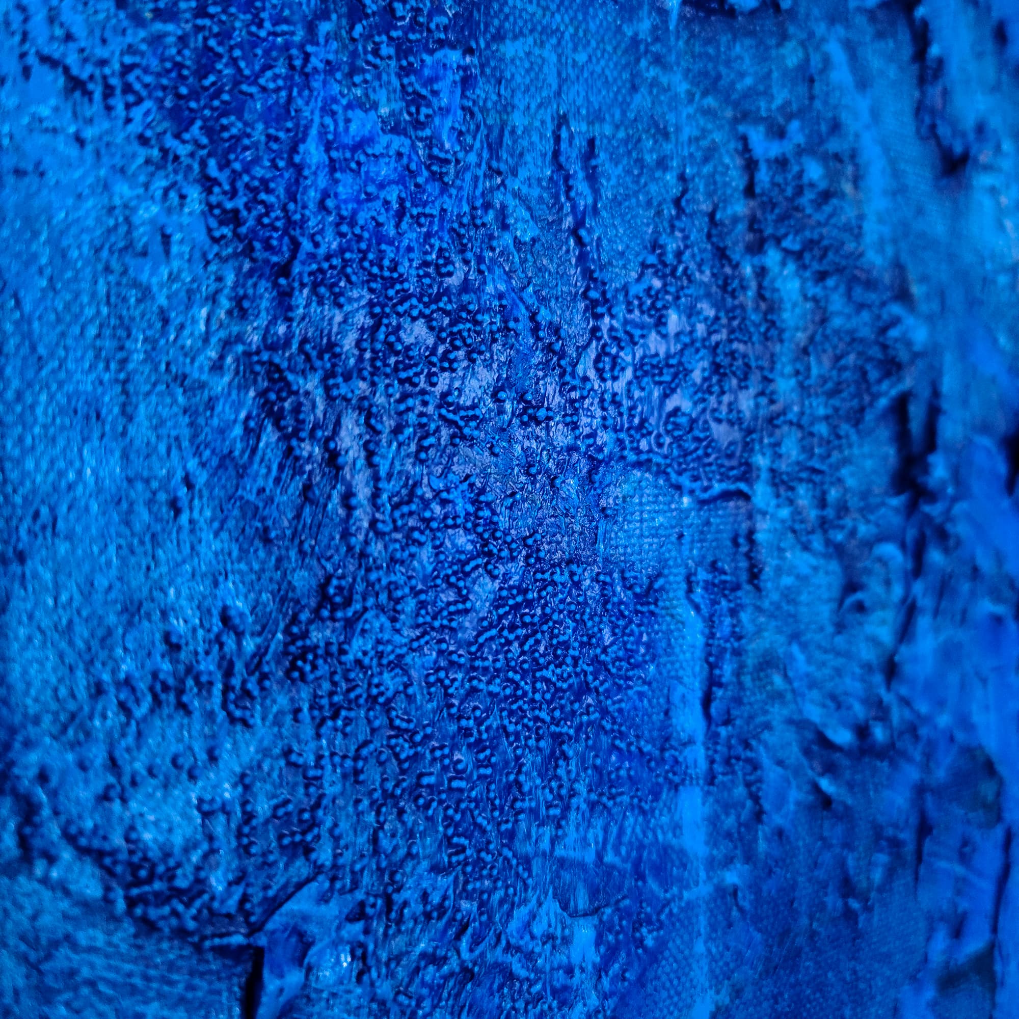
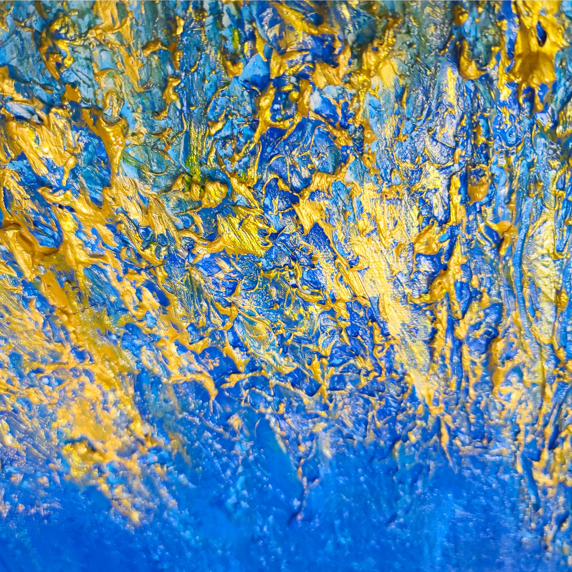
Blues, greens, and cool grays activate the parasympathetic system — the "rest and digest" mode. Cool-toned art promotes relaxation, reduces perceived stress, and can make small rooms feel larger. These colors are natural choices for bedrooms, meditation spaces, and offices where focused concentration matters. The ocean-inspired blues in pieces like Waterfalls or Blue Denim are particularly effective at creating calm.
Neutrals: Sophistication and Versatility
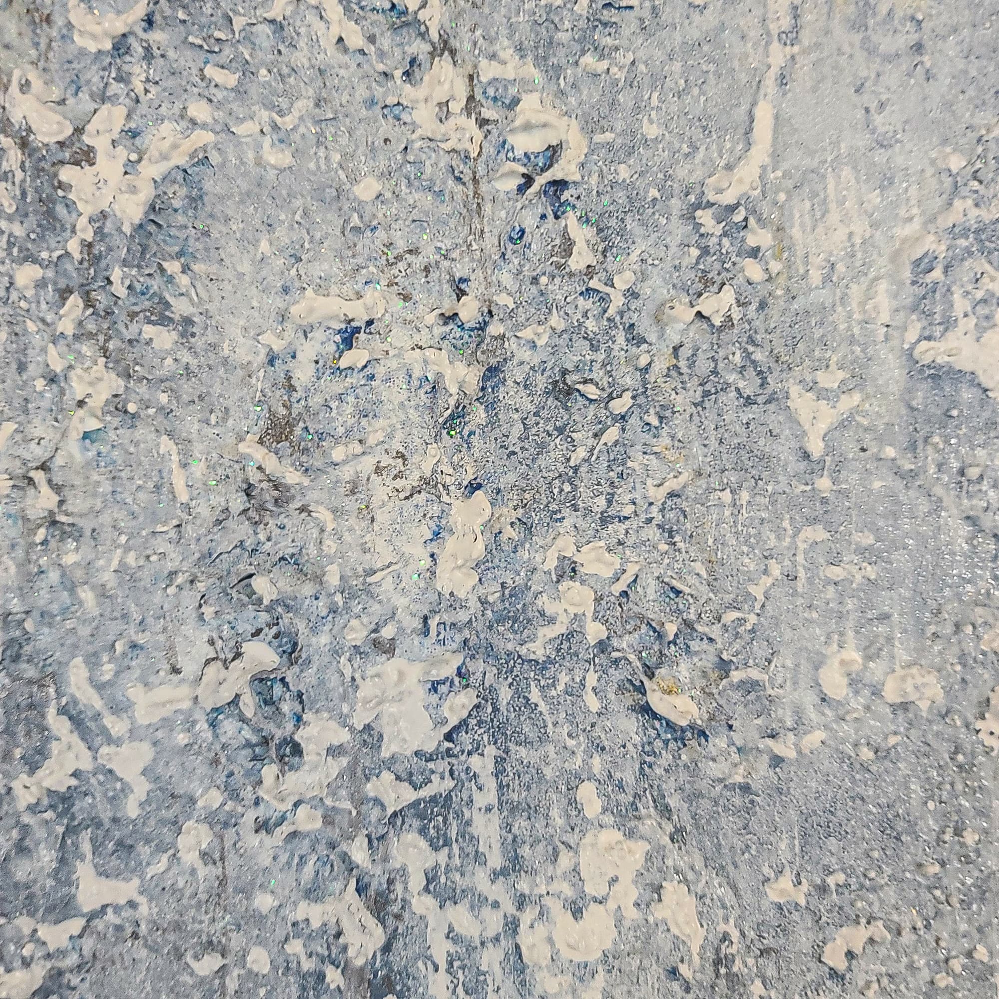
Grays, browns, taupes, and blacks are the unsung heroes of interior art. Neutral-toned paintings create sophisticated focal points without adding chromatic complexity to a room. They work with every color scheme and age gracefully through design trend cycles. In textured painting, neutrals are especially compelling because the lack of color distraction puts all attention on the physical surface — light, shadow, and depth become the entire visual experience.
The Power of Contrast
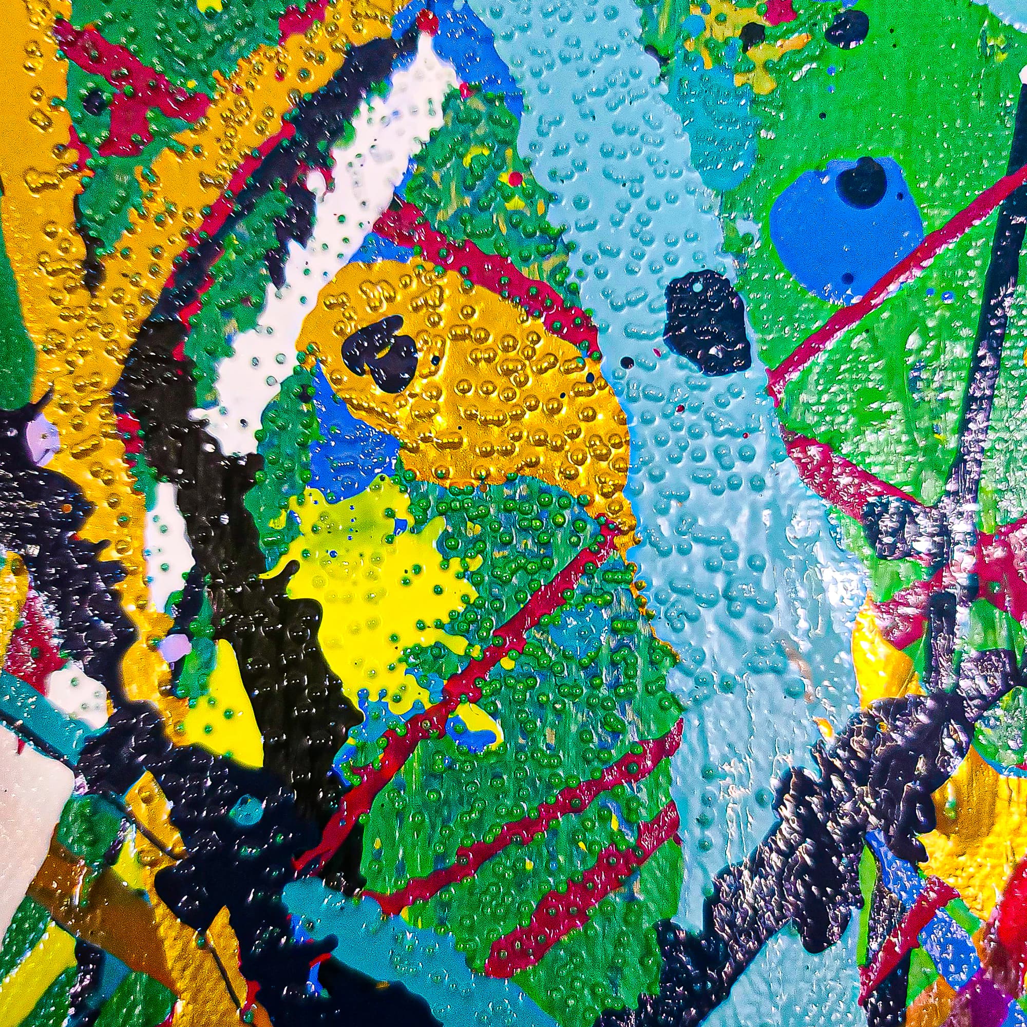
The most psychologically engaging abstract paintings use contrast — not just between colors, but between color temperatures, intensities, and scales. A painting that juxtaposes deep blue against warm gold, or rich black against bright white, creates visual tension that keeps the eye engaged. This tension is what separates art that holds your attention for years from art that fades into the background after weeks.
Choosing by Mood, Not Matching
Stop matching art to your sofa. Instead, ask: how do I want to feel in this room? Choose warm-toned art for energy and sociability. Choose cool tones for calm and focus. Choose high-contrast pieces for stimulation and drama. Browse our collection with this framework and you will find that the right piece becomes immediately obvious — it is the one that makes you feel the way you want to feel.
Tags